
AED Comparative Study
Usability Testing| Data Analysis
Team:
1 researcher from Philips, 1 school instructor, 4 HCDE master students
Duration:
Sep 2024 — Mar 2025
Background:
School project collaborated with Phillips
Methods:
Quantitive and qualitative research methods
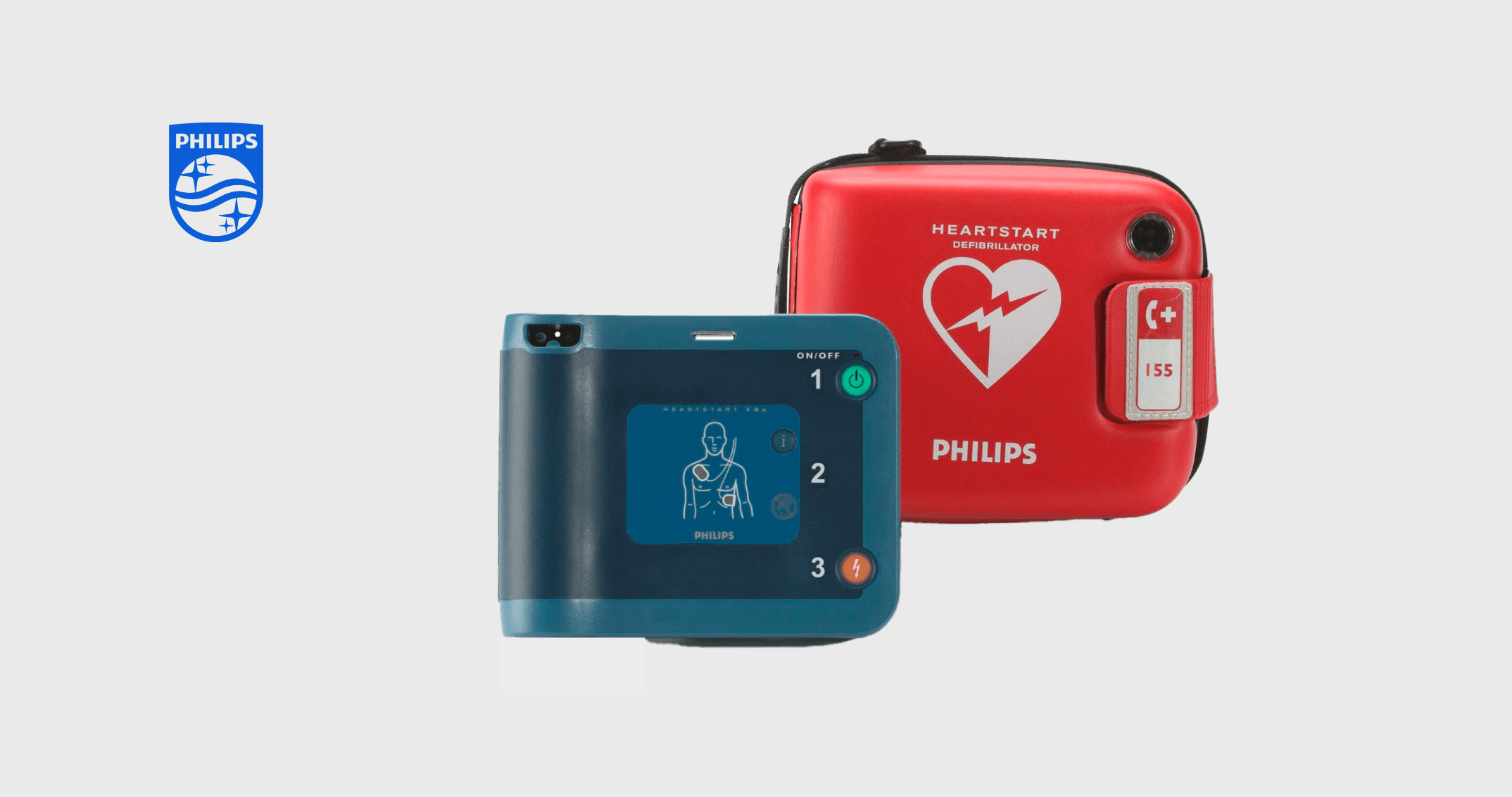
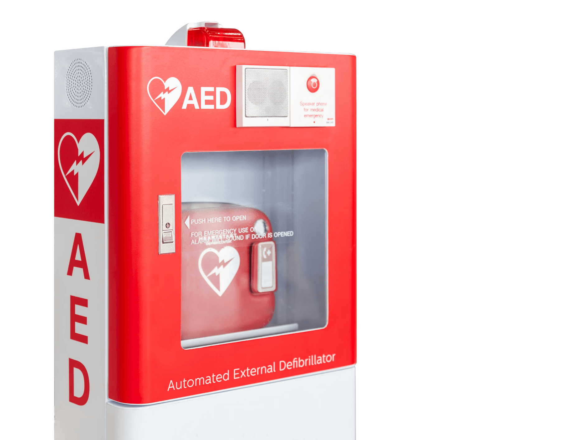
Automated External Defibrillator
AED is a portable medical device designed to assist individuals experiencing sudden cardiac arrest or a heart attack.
Commonly found in public spaces, it enables bystanders to respond quickly in life-threatening situations, potentially saving lives.
Background
Existing studies have only tested the devices in a simulated environment (e.g., no noise, no onlookers, etc.)
Existing studies have not explicitly explored the design specifications of the devices
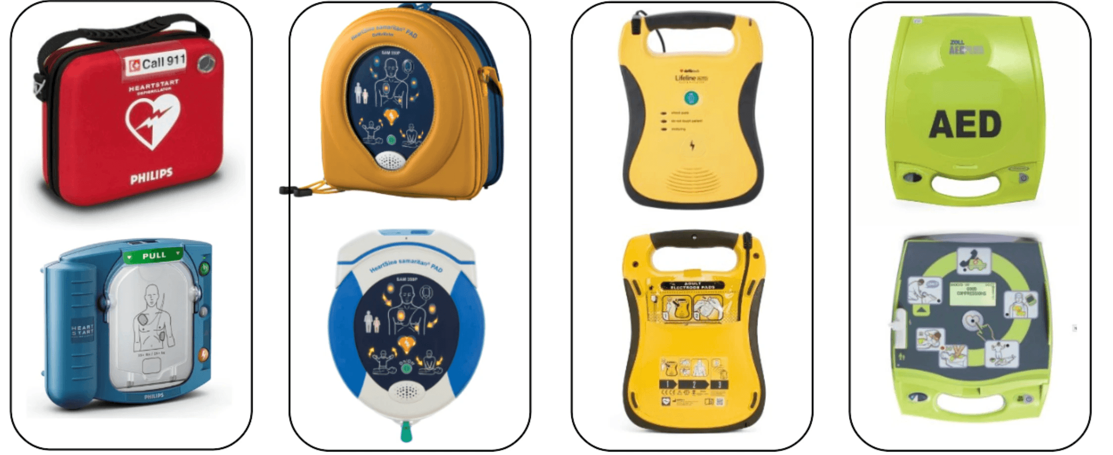
Comparative usability study of 4 on-market AEDs
How do lay people respond to public-access AEDs in an in-situ environment?
How does that inform the design of AEDs? (e.g., interface design, pad design, verbal, written, and graphical instructions, etc.)
Setting and task
We presented participants with a scenario in which they had to use an AED to save an unconscious person within 5 minutes. To simulate a realistic environment, we used a gym setting complete with background noise, music, and people.


Participants
We conducted testings with 86 participants, aged 18 to 70, with limited AED experience. The participants came from diverse backgrounds and had different education levels.
Data Collection
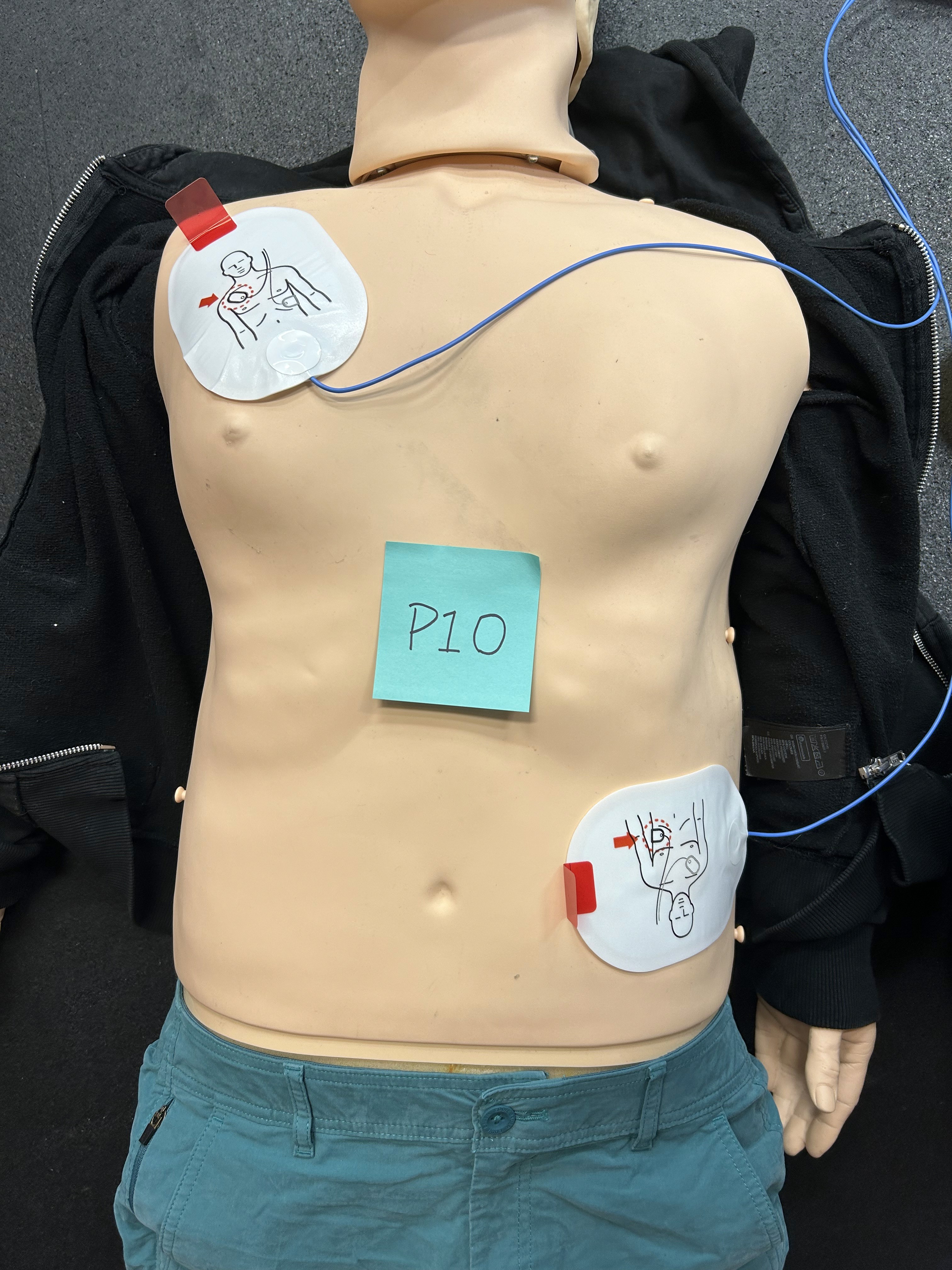
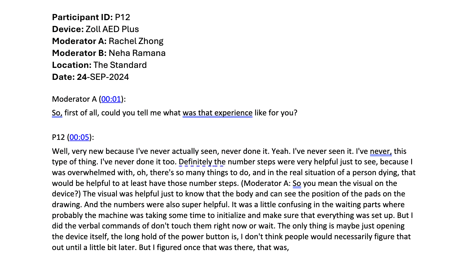
We recorded videos of participants during the testing process and captured photos of the pads placement. After the simulation, we asked participants questions about their experience:
General impressions
Device design
Pad placement process
Clarity of instructions
CPR instruction design
Qualitative Data Analysis
We analyzed participants' experiences and observations to identify recurring patterns and develop thematic codes.

Videos for observations
Interview Scripts for quotes

Affinity diagram to find patterns
Quantitive Data Analysis
We measured the time participants spent on each task and collected their experience ratings on a 1-5 scale for analysis.

Time Annotation
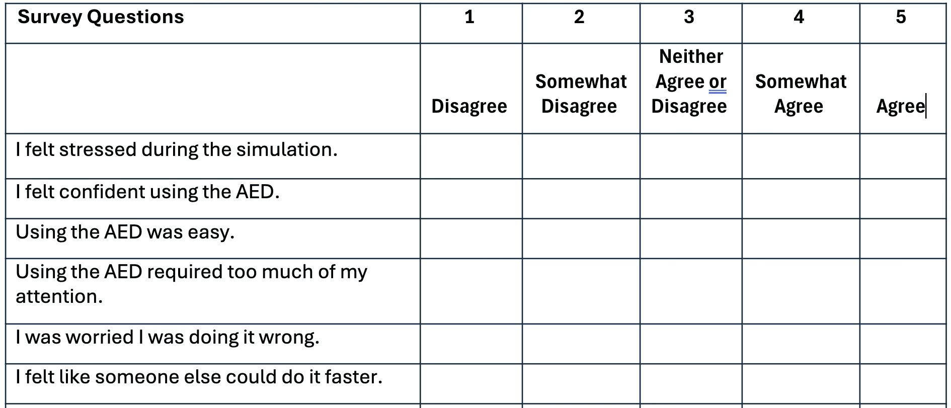
Experience on a scale of 1 to 5
Findings
We categorized the insights into different aspects, highlighting critical UX issues.
What I learned for future user experience design
Understand and accommodate diverse user needs. I’ve learned that people process information differently. I need to consider users' cognitive abilities and habits and ensure the design supports everyone.
Minimize cognitive load. Since people can only focus on so much at a time, I’ll prioritize simplicity. Keeping interfaces clean and focused will help avoid overwhelming users with unnecessary elements or distractions.
Clear information. It is important to provide clear information to users so they understand the steps, and to ensure that all information is consistent and aligned.
Provide feedback and confirmation. I’ve realized how important reassurance is for users. By providing clear feedback—using color, sound, or text—Design can confirm their actions and give them the confidence to keep going.
